
v2.4.2: Crisper Icons, Instant File Deletes, and Connector Cards You Can Finally Read

Not every release is a headline feature. Some are the quiet maintenance that decides whether the headline features feel good to use. v2.4.2 is one of those: a deliberate polish pass that sands down three rough edges you have probably noticed without quite naming them. The interface looks sharper, deleting files is instant, and the connector account cards are finally readable.
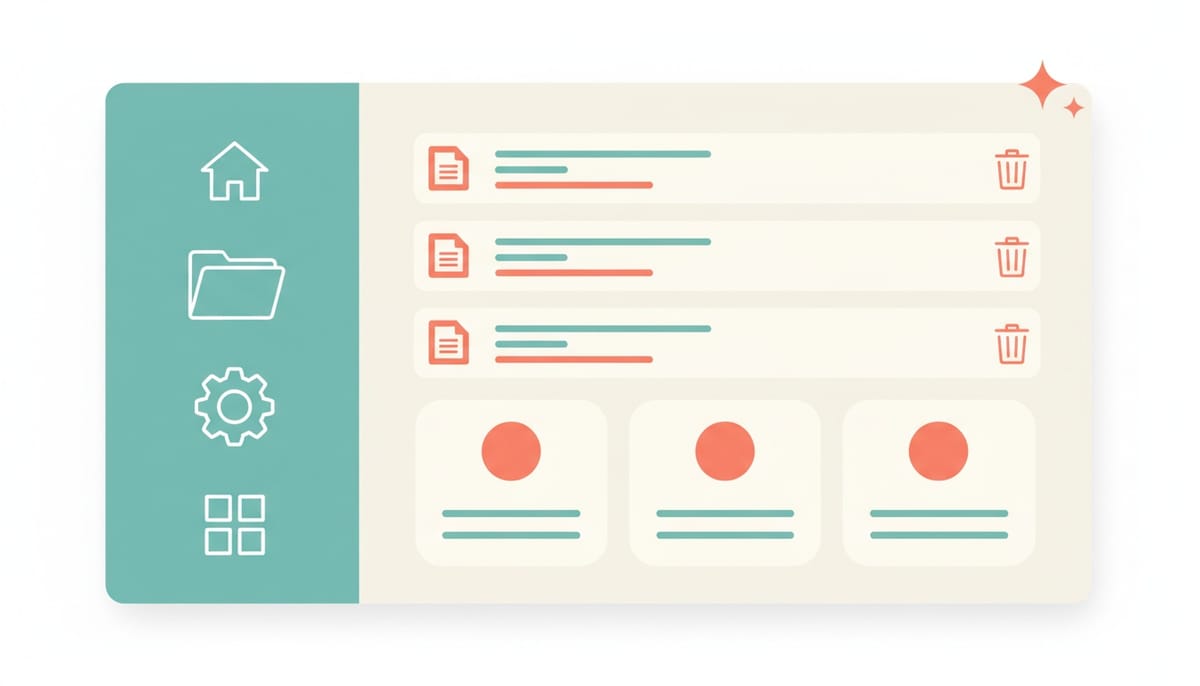
Emoji icons are gone
Scattered through the UI were little places where an emoji was standing in for a real icon. A 📎 next to an attached file. Emoji glyphs labeling the Edit Employee tabs. A gallery of agent templates each marked with a cartoon face. They worked, technically, but they rendered differently on every operating system, ignored your light or dark theme, and frankly looked like placeholders that never got replaced.
They are all gone now, swapped for crisp lucide SVG icons that follow the theme through currentColor, so they recolor correctly whether you are in light or dark mode. The cleanup reached:
- Attachment chips in the chat input. File-type icons are now chosen by MIME type: images, PDFs, audio, video, spreadsheets, archives, code files, documents, and a sensible generic fallback. Every one is theme-aware.
- SVG attachments. An attached
.svg, often a wide logo, used to be previewed as a tiny square image cropped to a broken-looking sliver. SVGs now show a cleanFileImageicon instead of a mangled thumbnail, while real raster images keep their normal preview. - The Edit Employee tabs. All ten (Identity, Professional, Personality, History, Psychology, Motivations, Relations, Humanizer, Tasks, Overview) now carry proper icons.
- The Create Employee template gallery. All twenty-one agent templates, from Full-Stack Developer to Data Analyst to DBA, render a matching
lucideicon rather than an emoji.
Small thing on its own. Together, the interface just reads as more finished.
The file explorer got faster to use
Two changes here, both about removing friction from deleting things.
Bulk delete. In selection mode there is now a Delete action that removes every selected file and folder at once, behind a single confirmation dialog. No more deleting items one at a time. If some items cannot be removed, the partial failures are reported clearly, and everything that can be deleted, is.
Instant delete. This is the one you will feel on every single delete. Removing an item no longer reloads the entire folder from the server. The item is dropped from the list locally the moment you confirm, so the view updates immediately, with no flicker and no round-trip lag. Single deletes and bulk deletes both work this way now. It is the difference between an action that feels snappy and one that makes you wait to find out if it worked.
Connector account cards you can actually read
This one had been quietly annoying anyone managing connected accounts. In Connectors, under Connected Accounts, each linked account was crammed onto a single horizontal line. The assign dropdown and the action buttons ate most of the width, which squeezed the actual account name and email down to a cryptic stub like "O / b..". You connected the account, but you could not tell at a glance which one it was.
The row is now stacked and legible. The account name and email sit on their own line up top, name on the left, email on the right, wrapping gracefully so the email drops below the name on narrow screens. Underneath, the assign-employee dropdown gets the full width, alongside the settings and disconnect buttons. You can finally read which account is which before you assign it to an employee.
We applied the exact same layout to every assignable connector: Google Workspace, Office 365, Microsoft Teams, and Slack. They all look and behave identically now, so there is nothing new to relearn as you move between them.
Why a polish release matters
It is tempting to skip writing about a release like this. No new capability shipped. But the truth is that trust in software is built and lost in exactly these details. An emoji that renders as a broken box, a delete that lags long enough to make you wonder if it failed, an account label you cannot read: each one is a tiny papercut that quietly tells you the product was not quite finished. Clearing them out is how the rest of the work earns its credibility.
v2.4.2 has no migration and nothing to configure. You will just notice that a few things that used to feel slightly off now feel right.
Want to test the most advanced AI employees? Try it here: https://Geta.Team